MTS Transit Visualization
Visualizes San Diego’s bus network, simulates bus arrivals and passenger wait times, and analyzes how real transit patterns differ from theoretical models.
MTS Transit: Navigating San Diego’s Bus Network 🚌
Project Overview
This project analyzes San Diego’s MTS bus network using GTFS-derived schedule data and city shapefiles. It visualizes route structures, evaluates inter-arrival intervals, and compares observed data against Poisson-based assumptions.
Objective
Generate geospatial visualizations of bus lines and stops, and assess how real-world arrival patterns deviate from theoretical stochastic models.
Implications
Transit systems are designed around schedules, not randomness. Analytical models must account for structured behaviors to avoid inaccurate assumptions.
Tools Used
- Python: Core programming language for data analysis and visualization.
- Pandas: Data manipulation and analysis.
- GeoPandas: Handling and visualizing geospatial data.
- Plotly: Creating interactive visualizations.
- Shapely: Geometric operations on spatial data.
- Matplotlib: Plotting static graphs and maps.
- NumPy: Numerical computations.
🛠️ Try It Yourself
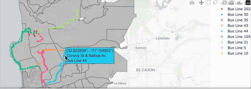
San Diego City Boundary Visualization
Description:
Build a clean, organized bus schedule and map visualization for selected San Diego routes:
create_detailed_schedule: Combine schedule, stop, and trip data into a structured DataFrame showing the full stop sequence for each trip. Ensure routes are sorted properly and grouped by bus line.visualize_bus_network: Plot the bus routes on an interactive map using Plotly, assigning each line a distinct color and enabling hover labels for bus stop names.
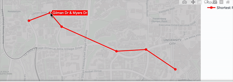
Finding the optimal rounte
Description:
Build a system to find the shortest bus route between two stops using a graph traversal approach:
find_neighbors: Identify all immediate next stops from a given station by looking across multiple bus trips and routes in the dataset.bfs: Implement Breadth-First Search (BFS) to find the shortest path (fewest stops) between a start and end station, returning an ordered list of stops with their coordinates.
Waiting Time Paradox Visualization
Description:
Simulate random bus arrival times over a day to explore the Waiting Time Paradox:
simulate_bus_arrivals_uniform: Generate random bus arrival times between 6 AM and midnight based on a given average arrival interval (tauminutes). Calculate the time gaps between each arrival to understand how real-world wait times differ from simple averages.
In a Poisson process, the time between events follows an exponential distribution—shorter intervals are more frequent, but longer gaps still occur. This explains the Waiting Time Paradox: if you arrive at a random time, you’re more likely to land within a longer interval between buses, which skews your average wait time higher than expected.
Why the Bus Feels Late: Simulating Bus Transit Patterns
Description:
Simulate and visualize how passenger wait times vary throughout the day to better understand the Waiting Time Paradox:
simulate_wait_times: Generate random passenger arrival times and calculate how long each person waits for the next bus. Return a DataFrame with each passenger’s wait time and the bus they board.visualize_wait_times: Create a Plotly visualization showing both bus and passenger arrivals over a selected one-hour window. Plot each passenger’s wait time as a vertical line, helping illustrate how some passengers wait much longer than others due to randomness in arrival times.
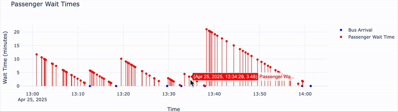
The Waiting Time Paradox occurs because when you arrive at a bus stop at a random time, you are more likely to land during a longer interval between buses. Longer intervals cover more time, increasing the chance that you find yourself waiting during one of these gaps.
This paradox helps explain why passengers frequently experience longer wait times than scheduled intervals would suggest.
By simulating and visualizing bus arrivals and passenger waiting times within a specific one-hour window, we can see this phenomenon clearly — and better appreciate the hidden challenges of real-world transit systems.
📈 Comparing Simulated and Real Bus Arrival Times
Real Bus Arrival Data
Until now, we used simulated bus arrival data based on the Poisson process.
Now, we’ll look at real bus arrival data at the UTC Transit Center to see if it follows the same pattern.
We will:
- Calculate the time between real bus arrivals.
- Compare the real intervals to our simulated data.
- See if real bus arrivals follow an exponential distribution like a true Poisson process.
If they do, real buses behave like our simulation.
If not, it shows that real-world factors (like traffic and scheduling) cause differences.
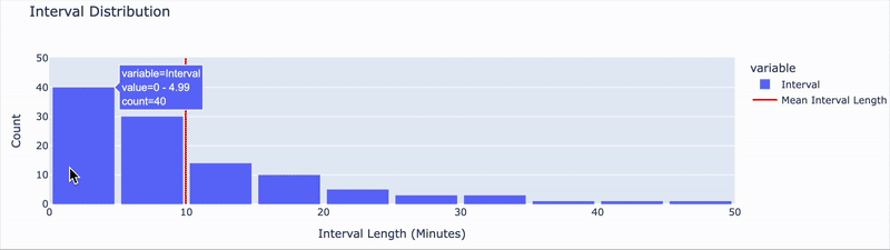
🚍 Does the Waiting Time Paradox Still Hold in Real Bus Data?
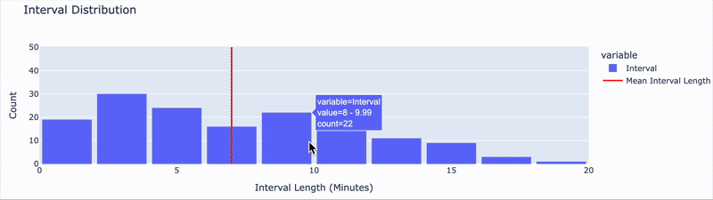
After analyzing real-world bus arrival intervals, we find that they do not decrease exponentially.
This means that actual bus arrivals do not follow a Poisson process — which makes sense, since real buses follow planned schedules rather than random timings.
Even though arrivals aren’t purely random, we can still test whether the Waiting Time Paradox appears in practice:
The paradox suggests that the average wait time for a randomly arriving passenger is longer than half the average interval between buses.
Using the simulate_wait_times() function on real bus data:
- Average Bus Arrival Interval: ~7.0 minutes
- Average Passenger Wait Time: ~5.0 minutes
While the average wait time is slightly under the interval midpoint, it’s still noticeably longer than what passengers might expect if they assumed buses arrived perfectly evenly.
This confirms that the paradox still applies — not because of randomness, but because passengers are more likely to arrive during longer gaps, which skew average wait times upward.
Even in a structured transit system, the effect remains visible, illustrating how human experience can differ from schedule-based expectations.
🧾 Conclusion
This project explored the behavior of bus arrivals and passenger wait times through both simulated and real-world data. Using tools like pandas, Plotly, and graph algorithms, we built a detailed view of San Diego’s bus network, simulated bus and passenger arrivals, and visualized patterns across multiple scenarios.
Through simulation, we confirmed the Waiting Time Paradox: passengers arriving at random times often wait longer than expected due to the exponential nature of time intervals in a Poisson process. Interestingly, even real bus data — which does not follow a Poisson distribution — still showed signs of the paradox. Although actual bus systems are structured and scheduled, passengers tend to arrive during longer intervals, resulting in wait times that are longer than half the average interval.
These findings highlight a key insight: even in systems designed for regularity, human experience can feel irregular due to the way time intervals play out. This has important implications not only for transit planning but also for how we model and interpret randomness in real life.
Overall, this project was a blend of theory and practice, showing how statistical models and simulations can help explain everyday phenomena — and why the bus always seems late.